MONEY
MATTERS
SORTED
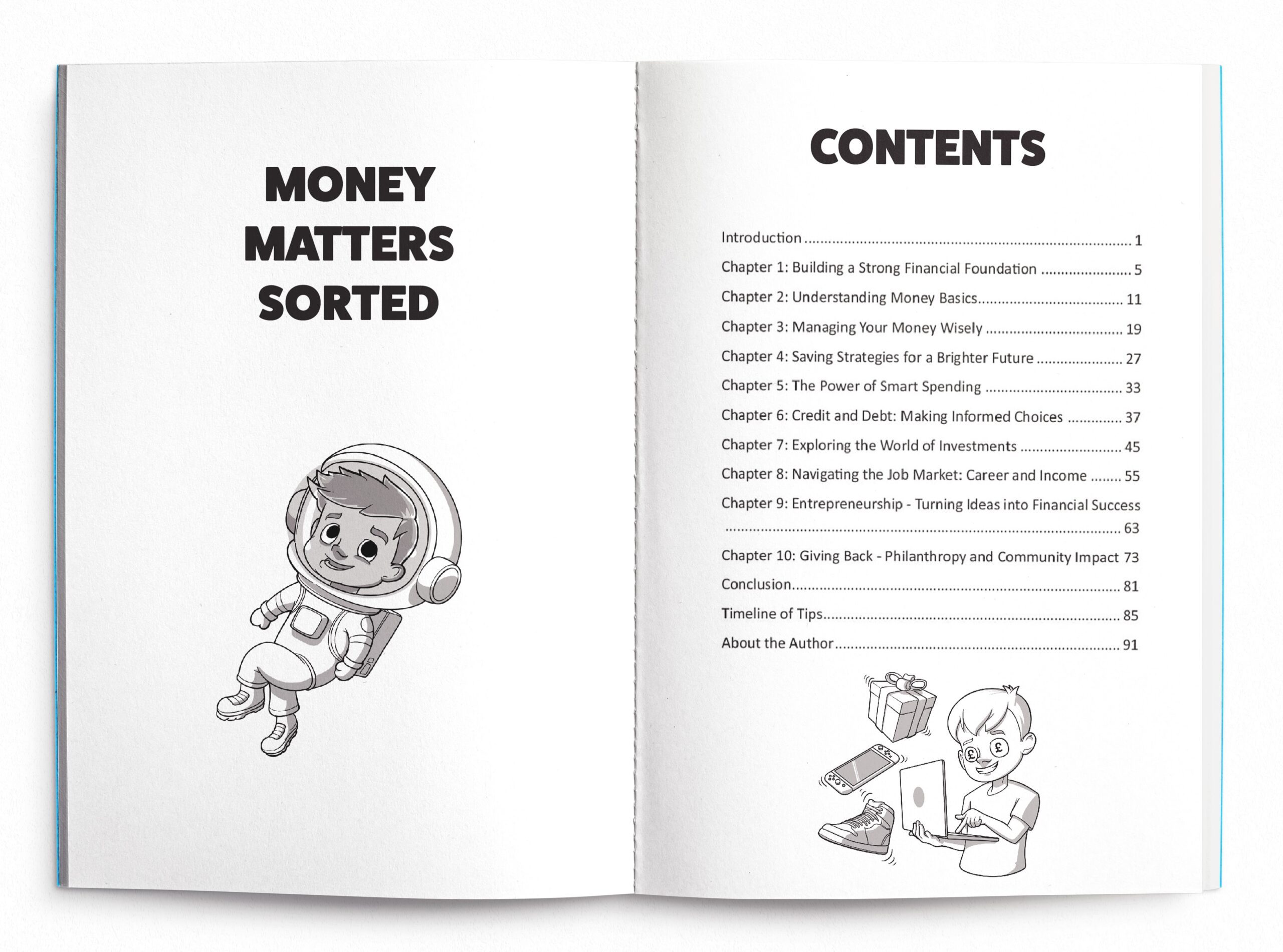
I had the exciting task of illustrating the front cover and over 40 internal black-and-white humorous illustrations for a book about handling finances for young people. The cover design needed to be eye-catching and fun, reflecting the playful yet educational nature of the content. I used bold lines and bold colours to create an inviting and lively cover that would appeal to a younger audience. For the internal illustrations, my goal was to infuse humor into financial topics, making them more engaging and less intimidating. Each illustration was designed to simplify and lighten complex financial concepts, using humor to enhance understanding and retention. Throughout the process, I worked closely with the author to ensure that every illustration aligned with the book’s message and tone, ultimately creating a cohesive and enjoyable learning experience for young readers.


