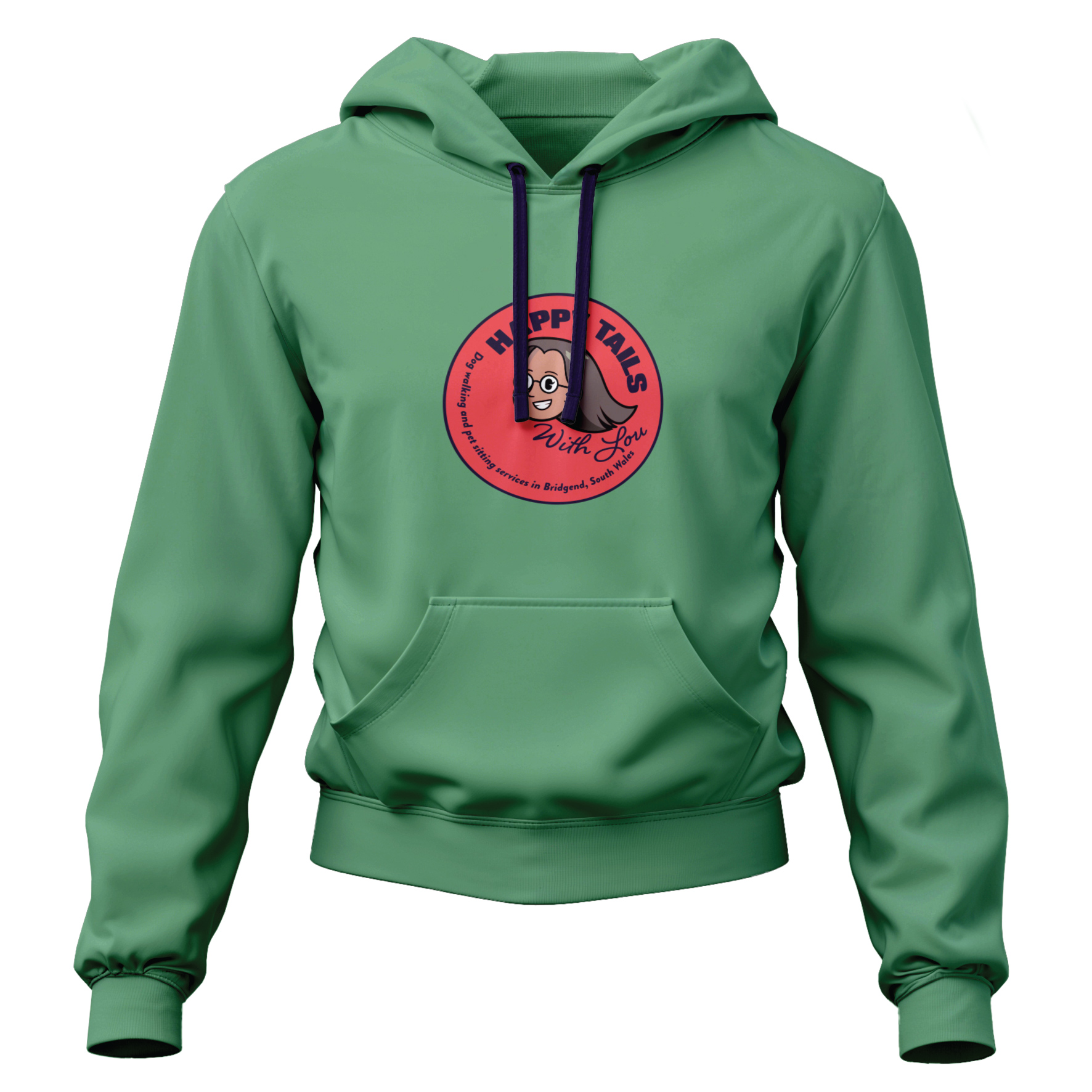
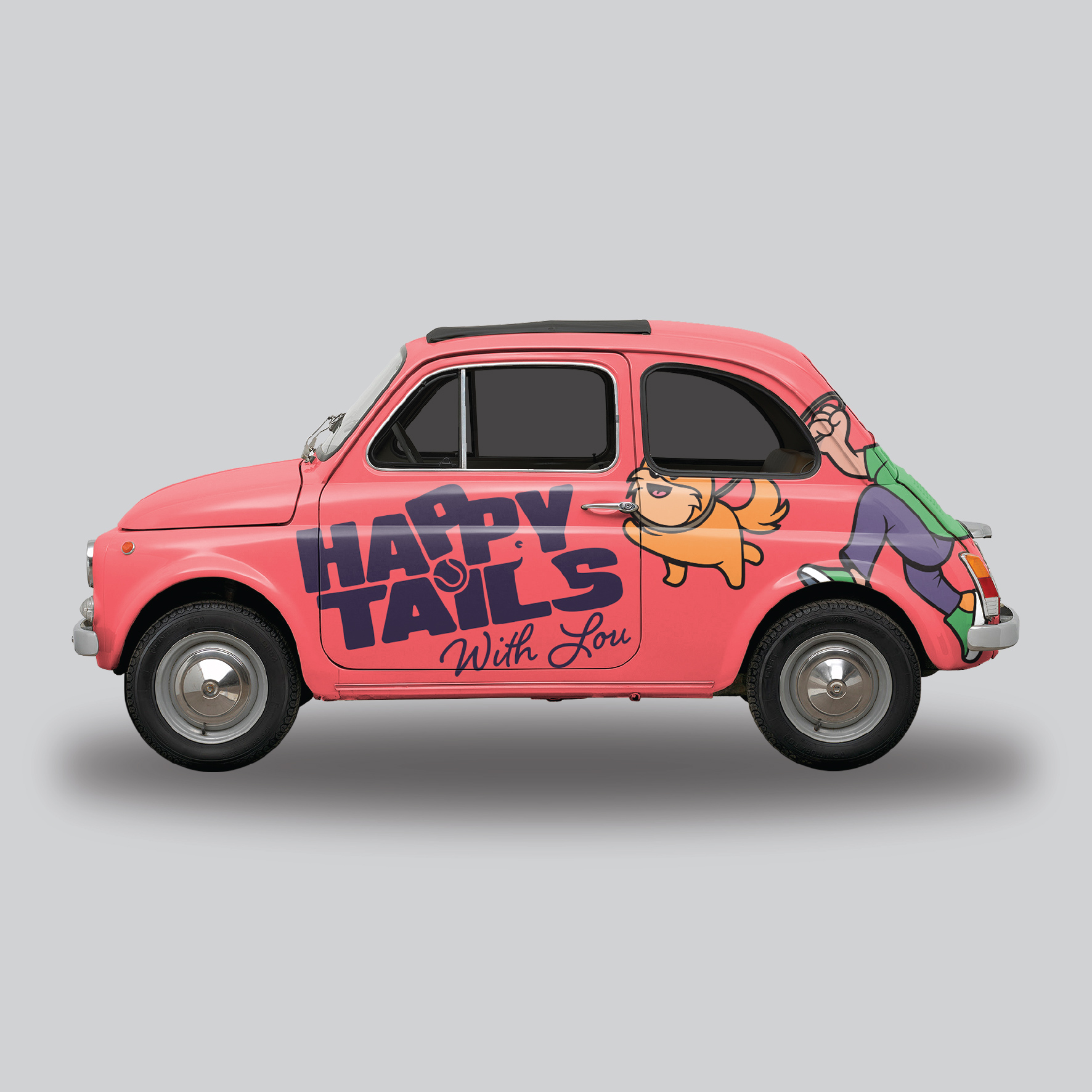
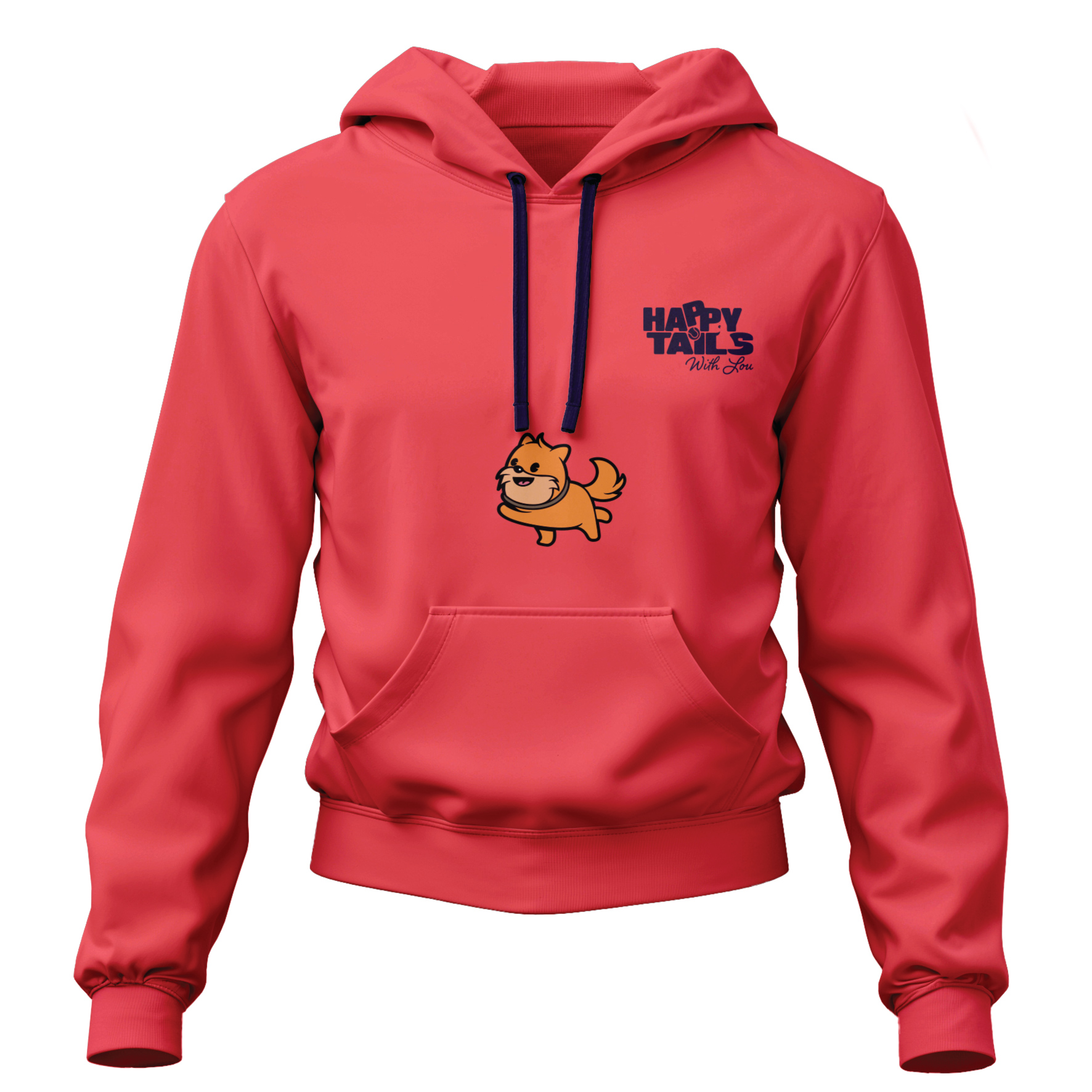
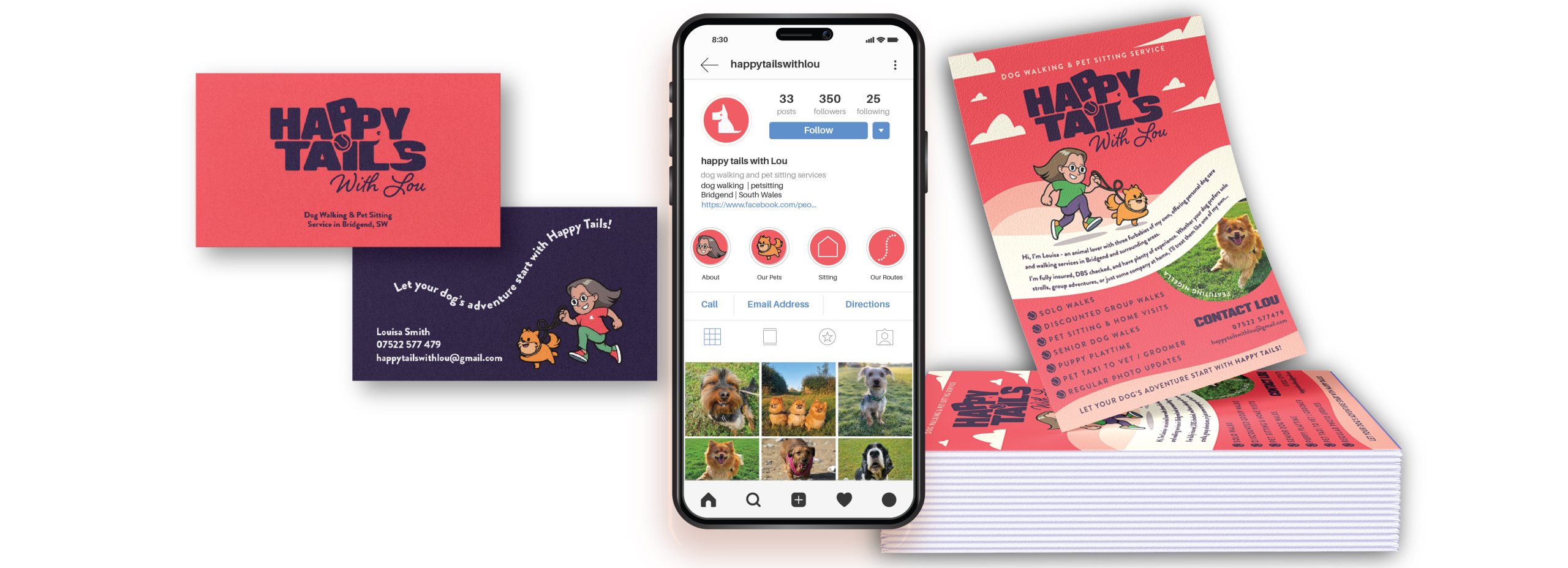
The Happy Tails brand was designed to feel both bold and approachable, perfectly reflecting a friendly dog-walking and sitting service.
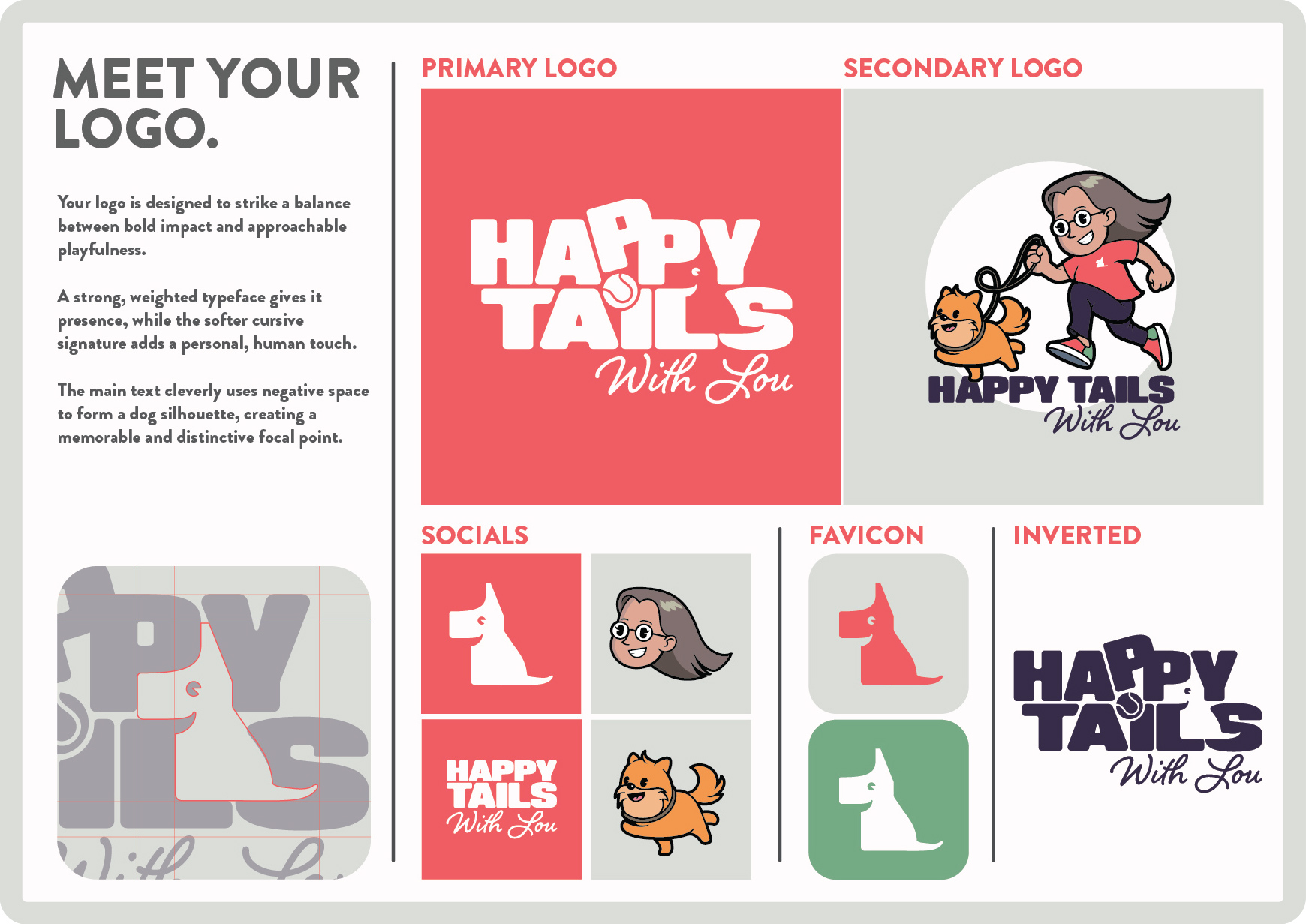
The logo strikes a balance between strong impact and playful charm. A bold, weighted typeface gives it presence and confidence, while a softer cursive signature adds a warm, personal touch. To make it truly memorable, the main text cleverly uses negative space to reveal a dog silhouette, creating a distinctive focal point that instantly communicates what the brand is about.
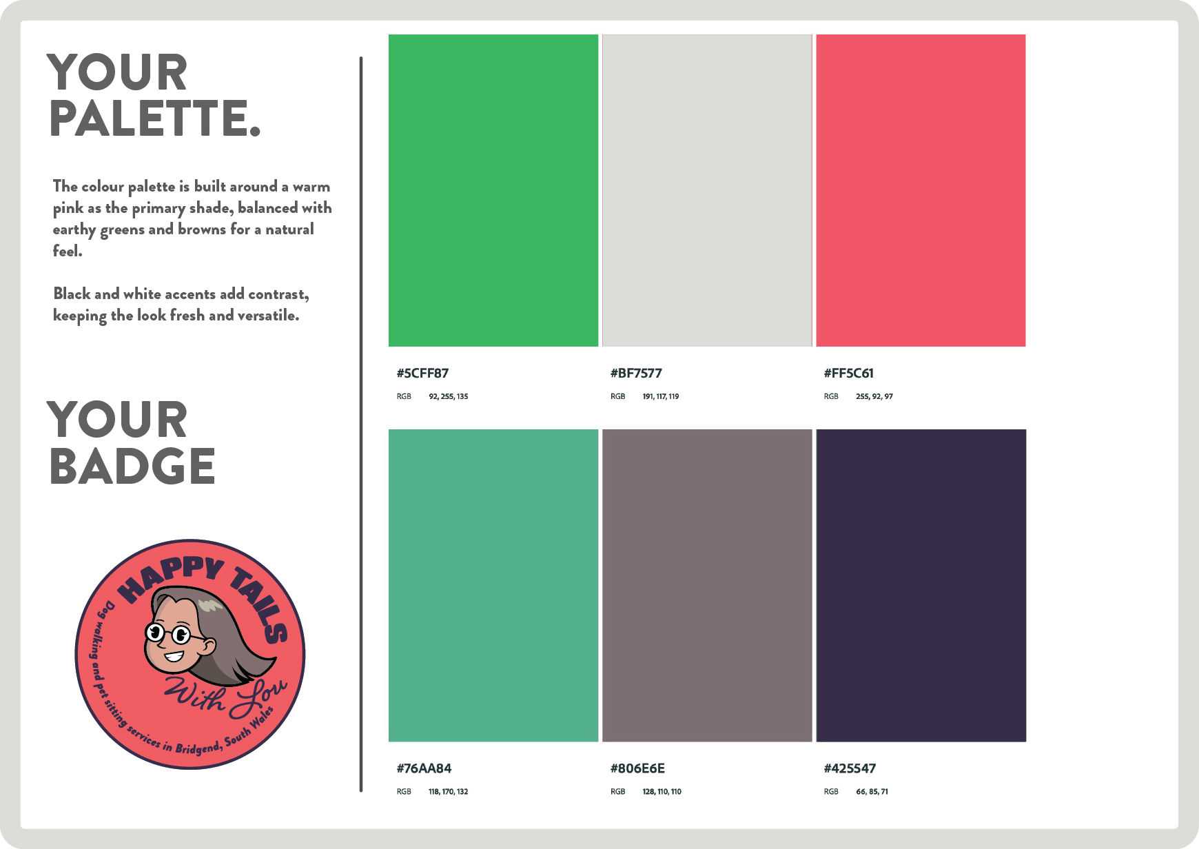
The colour palette is built around a cheerful, warm pink as the primary shade, paired with earthy greens and browns to give a natural, outdoorsy feel. Black and white accents provide contrast, ensuring the look stays clean and versatile across applications.
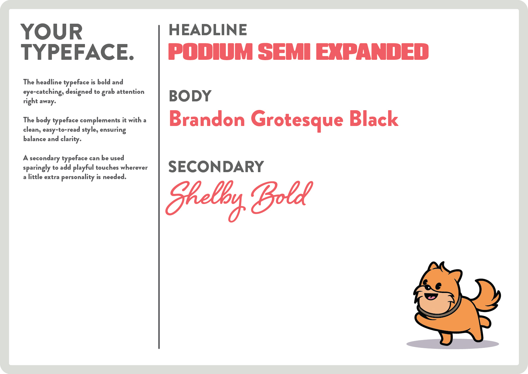
The typography system reinforces the brand personality. The headline typeface is bold and eye-catching, perfect for grabbing attention in social posts and signage. The body typeface is clean and easy to read, keeping information clear and approachable. A secondary typeface is used sparingly to add playful moments and bring extra personality to key touchpoints.
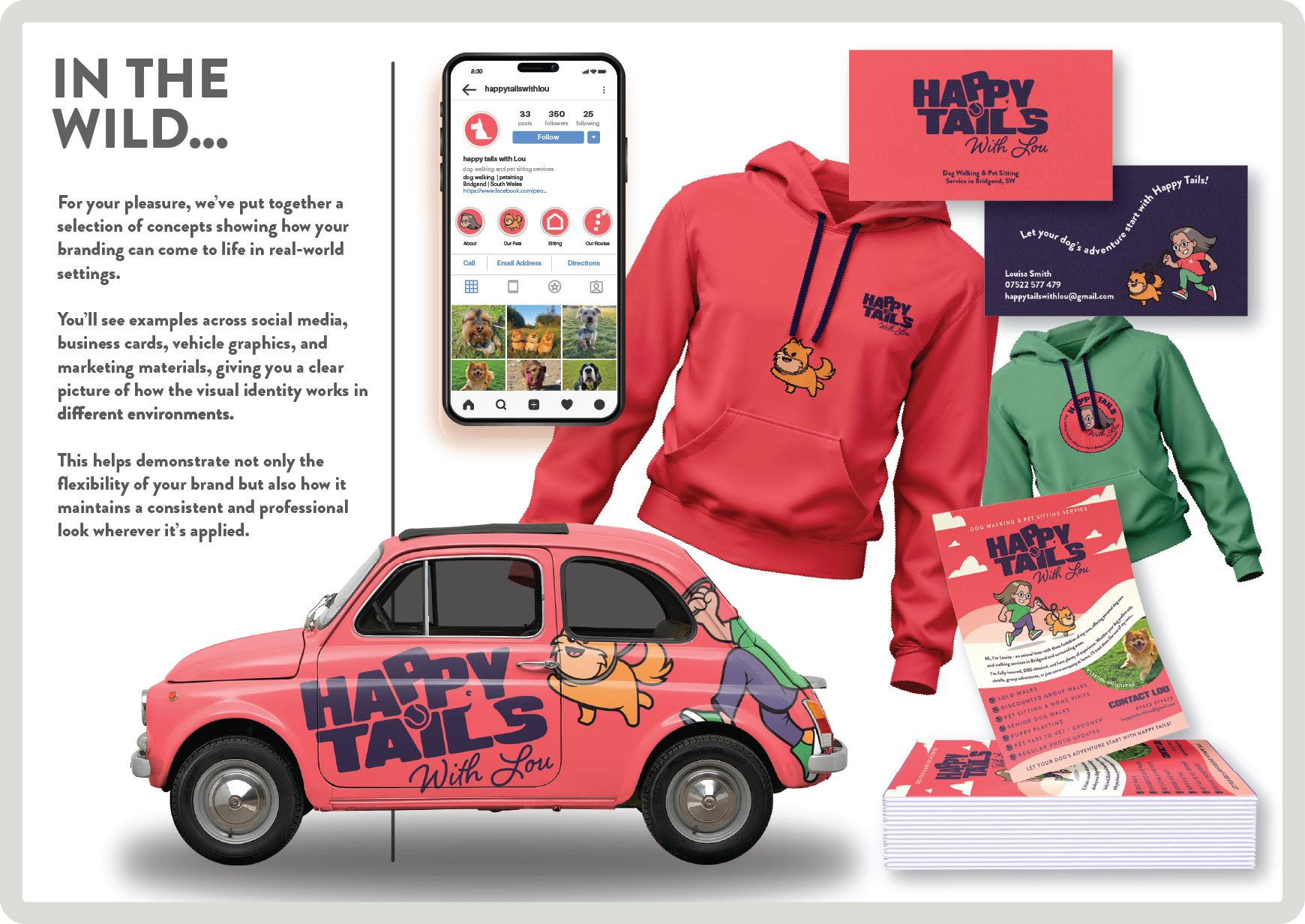
This combination of logo, colour, and typography creates a cohesive identity that feels professional, friendly, and full of life — just like Happy Tails.